A Swiss-inspired identity for a builder-first conference
A Swiss-inspired identity for a builder-first conference
2026
2026
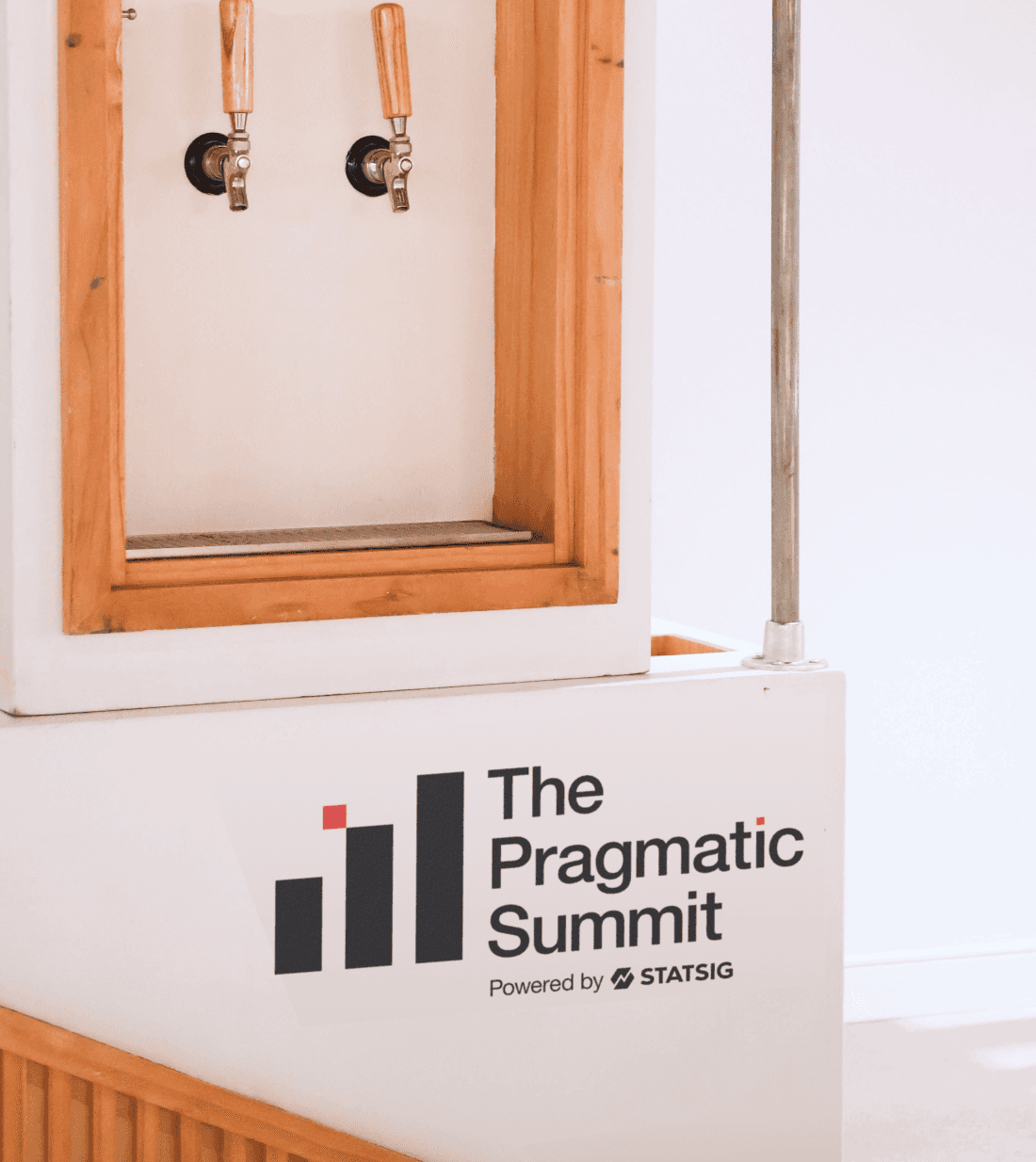
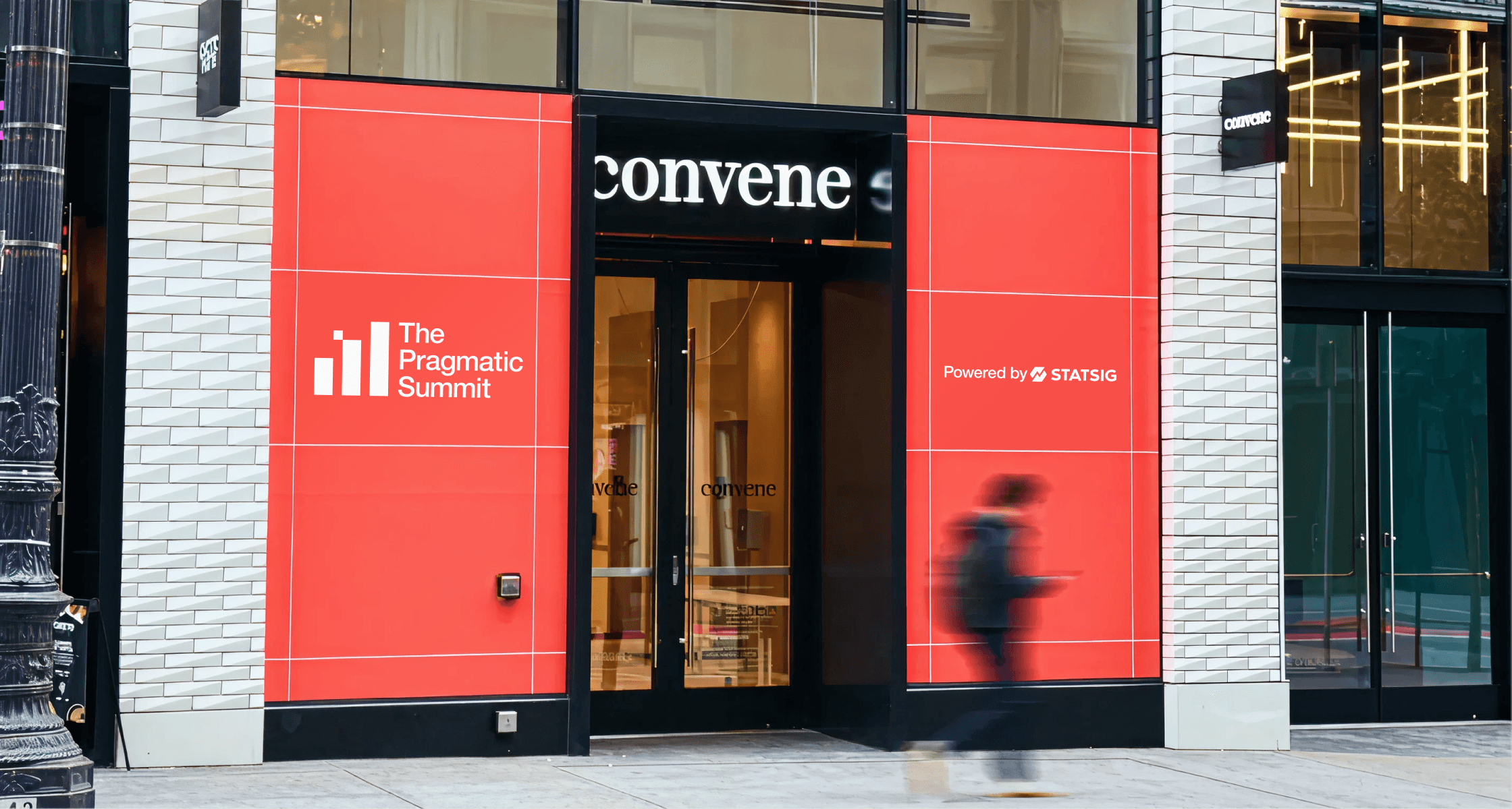
The Pragmatic Summit is a one-day conference created in partnership with The Pragmatic Engineer, bringing together senior engineers and product leaders for practical, experience-driven conversations. The visual identity blended together Statsig’s clarity and technical precision with TPE’s no-fluff, builder-first ethos. The result was a brand system that bridged two distinct brands, grounded in a Swiss-inspired design approach using disciplined grids, clear hierarchy, and typographic precision as the underlying framework.
The Pragmatic Summit is a one-day conference created in partnership with The Pragmatic Engineer, bringing together senior engineers and product leaders for practical, experience-driven conversations. The visual identity blended together Statsig’s clarity and technical precision with TPE’s no-fluff, builder-first ethos. The result was a brand system that bridged two distinct brands, grounded in a Swiss-inspired design approach using disciplined grids, clear hierarchy, and typographic precision as the underlying framework.
[ role ]
[ role ]
Lead Designer
Lead Designer
Event Branding
Event Branding
Art Direction
Art Direction
[ team ]
[ team ]
Morgan Scalzo
Morgan Scalzo
Sami Springman
Sami Springman
Christie Chong
Christie Chong
Talia Morris
Talia Morris
Ian Ito
Ian Ito
Cat Lee
Cat Lee
[ partners ]
[ partners ]
Gergely Orosz
Gergely Orosz
Pair Design
Pair Design
Campfire Collective
Campfire Collective
A Swiss-inspired identity for a builder-first conference
2026
The Pragmatic Summit is a one-day conference created in partnership with The Pragmatic Engineer, bringing together senior engineers and product leaders for practical, experience-driven conversations. The visual identity blended together Statsig’s clarity and technical precision with TPE’s no-fluff, builder-first ethos. The result was a brand system that bridged two distinct brands, grounded in a Swiss-inspired design approach using disciplined grids, clear hierarchy, and typographic precision as the underlying framework.
[ role ]
Lead Designer
Event Branding
Art Direction
[ team ]
Cat Lee
Morgan Scalzo
Sami Springman
Christie Chong
Talia Morris
Ian Ito
[ partners ]
Pair Design
Campfire Collective
Gergely Orosz

The system was anchored in disciplined grids, strong typographic hierarchy, and intentional negative space as the foundation for every layout. The grid became more than structure; it created opportunities for lines and bounded space to act as design elements—carving the layout into rectangular fields that added rhythm and texture.
For the first time, Statsig introduced a bright, saturated red, using it as a high-contrast signal within the otherwise restrained framework. I led the event design end to end, applying the system across stage scenics, signage, digital assets, print, and merch, ensuring every touchpoint felt cohesive, deliberate.