The making of Staticons
The making of Staticons
The making of Staticons
2025
2025
2025
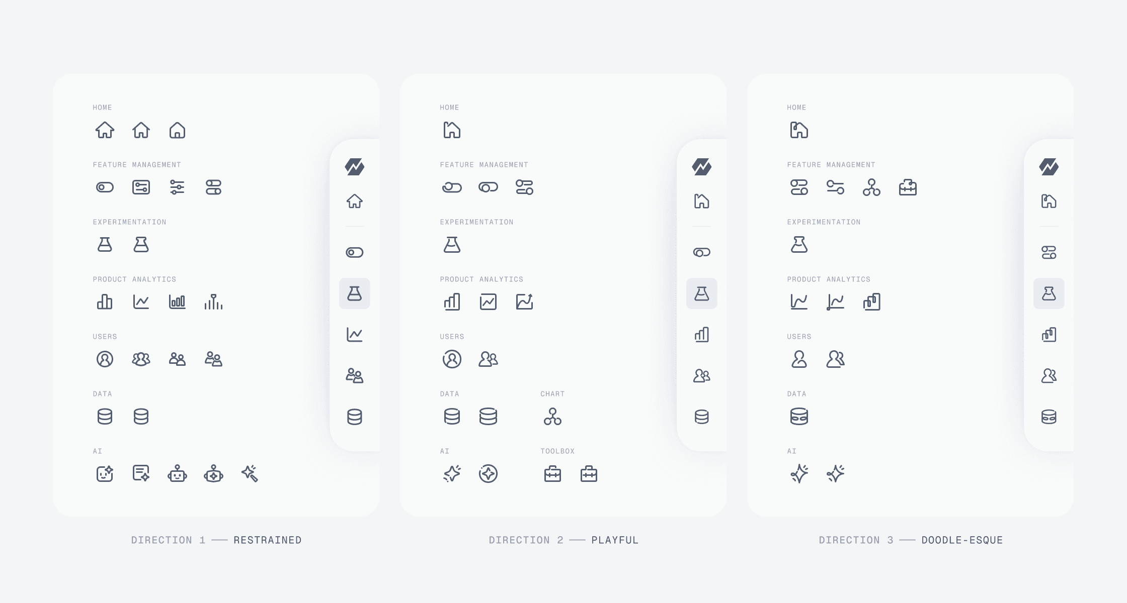
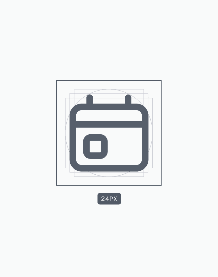
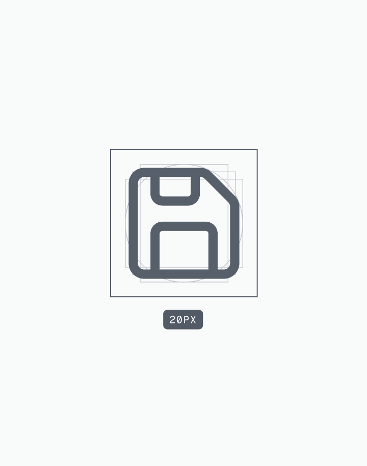
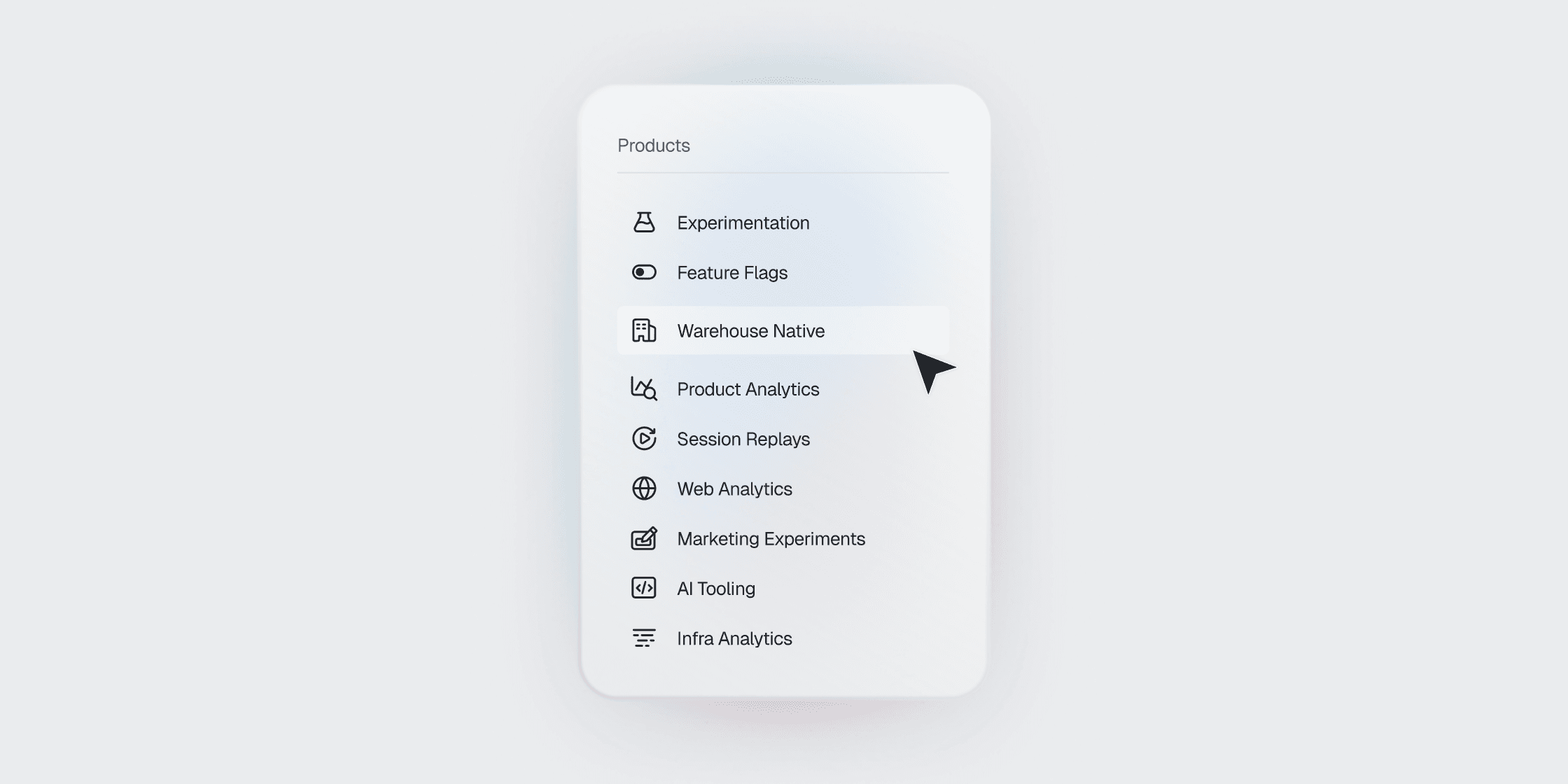
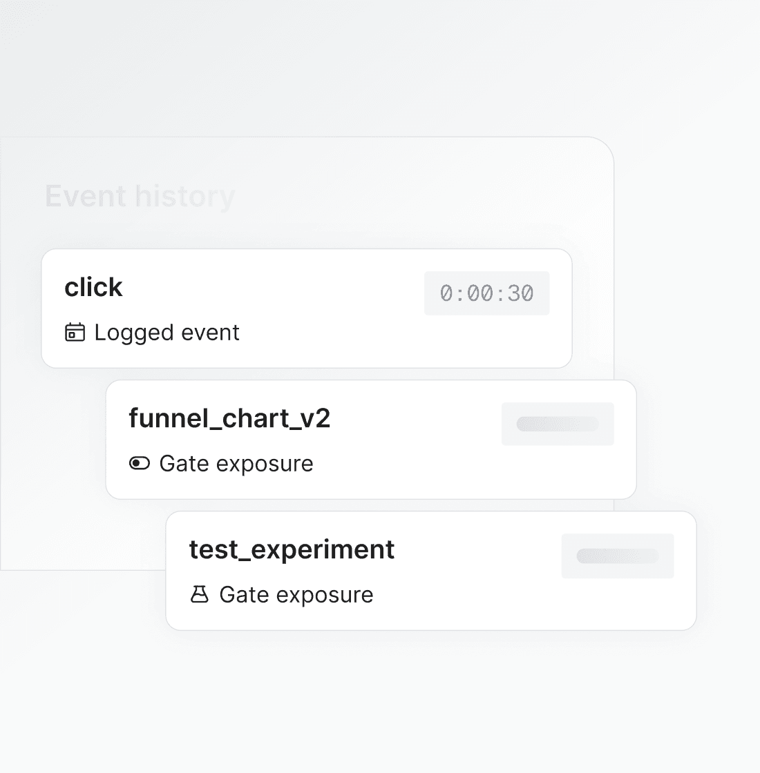
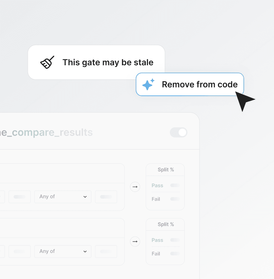
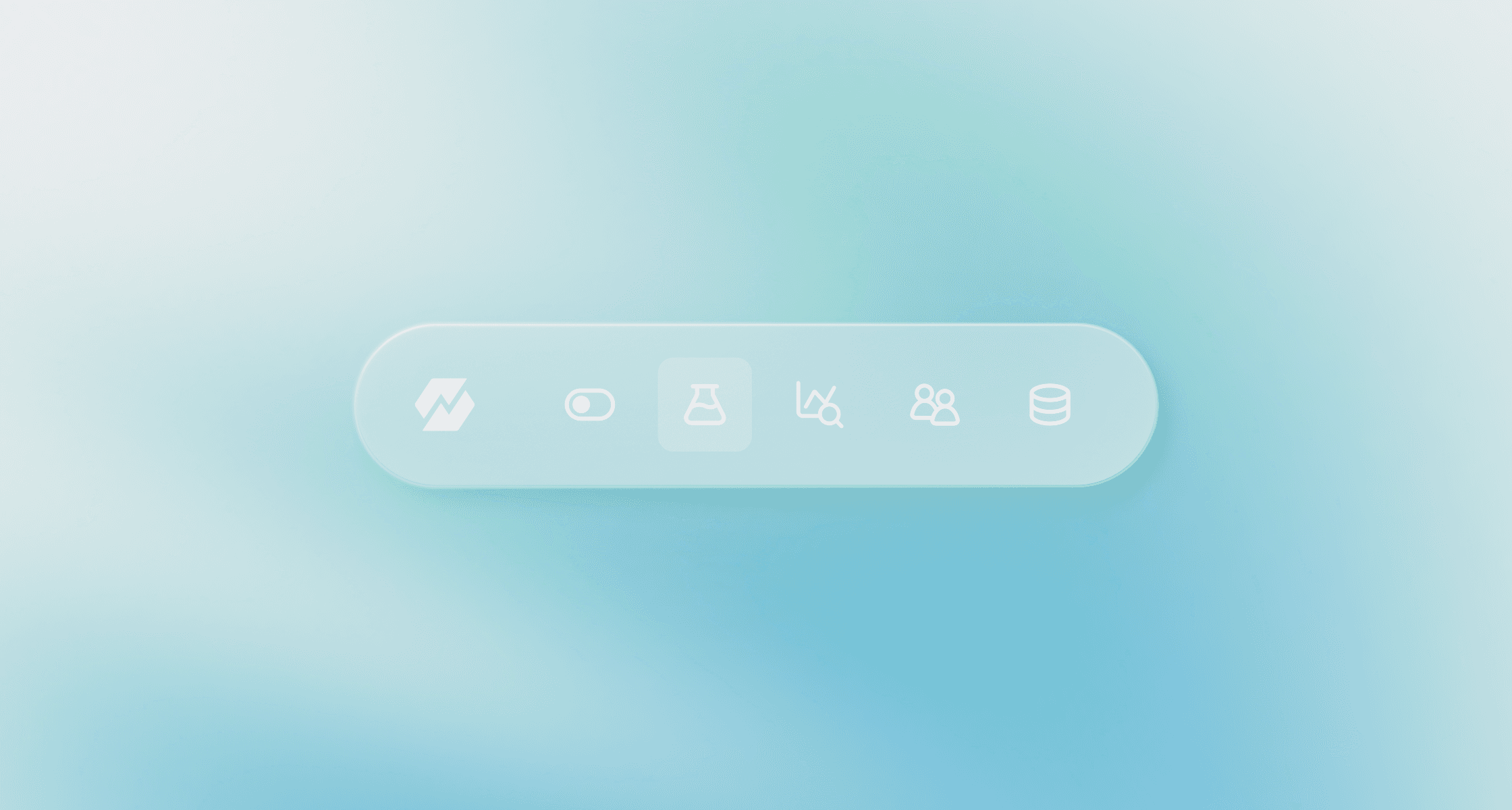
As Statsig grew, its existing icon set started to show at the seams: product and marketing were pulling from different places, and the visual language felt inconsistent. I led the design of Staticons, a custom icon library that replaced Google Material icons with a minimal, rounded style built for Statsig’s evolving brand. The project involved a full audit, defining clear guidelines (sizes, stroke, spacing), and building a scalable Figma library teams could rely on across surfaces.
Read more about the revamp here.
[ role ]
[ role ]
[ role ]
Lead Designer
Lead Designer
Lead Designer
Icon Design
Icon Design
Icon Design
[ team ]
[ team ]
[ team ]
Minhye Kim / Design Lead
Minhye Kim / Design Lead
Minhye Kim / Design Lead
Cynthia Xin
Cynthia Xin
Cynthia Xin
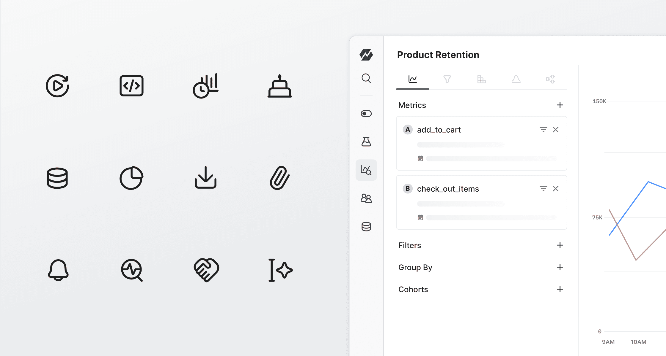
Before Staticons, icons were sourced from Google Material and applied inconsistently across touchpoints. Mismatched stroke weights, corner radii, and sizing made experiences feel fragmented, especially as the brand matured. Staticons solved this by replacing the patchwork with a single, shared library built on clear standards. By standardizing stroke, geometry, and spacing, icons feel more intentional, on-brand, and easier for teams to apply with confidence—bridging the gap between brand and product.
Before Staticons, icons were sourced from Google Material and applied inconsistently across touchpoints. Mismatched stroke weights, corner radii, and sizing made experiences feel fragmented, especially as the brand matured. Staticons solved this by replacing the patchwork with a single, shared library built on clear standards. By standardizing stroke, geometry, and spacing, icons feel more intentional, on-brand, and easier for teams to apply with confidence—bridging the gap between brand and product.
Before Staticons, icons were sourced from Google Material and applied inconsistently across touchpoints. Mismatched stroke weights, corner radii, and sizing made experiences feel fragmented, especially as the brand matured. Staticons solved this by replacing the patchwork with a single, shared library built on clear standards. By standardizing stroke, geometry, and spacing, icons feel more intentional, on-brand, and easier for teams to apply with confidence—bridging the gap between brand and product.